First, for those of you reading this who have started your disability ministry, we applaud you. You might not realize this but out of the estimated 380,000 churches, your desire to minister to those affected by disability places you in just 10% of churches who are doing the same. Knowing that somewhere around 350,000 churches have no disability outreach plans is disheartening at times, which means we also need to recognize those that are doing something.
Now that you have started your outreach to those affected by disability, you must let everyone know. While “If you build it, they will come” was a fantastic line delivered in Field of Dreams, that is not always the reality. It takes a continued effort of communication and awareness just to let others know about your ministry.
Unfortunately, many churches that offer such services don’t always do the very best job at getting the word out.
And we get the whole “non-profit budget” idea, trust us. With that in mind, here are some low-cost steps to take to help let your church members know about your ministry:
- Update Your Website: You would be surprised at how many churches that have a disability ministry do not have any information about it at all on their website. Make this information a page on its own and not simply tossed in at the end of the children’s ministry page. While researching church websites, I found one location had a disability ministry yet it was nowhere to be found in their website navigation. Turns out the only way to find it was to either use their search function or to scroll to the very end of the main page, beyond the sermons and videos, and then click on a small box labeled “special needs”. People come into your website from a variety of sources and you cannot count on them always ending up on the home page every single time. No matter what page they land on, they need quick and easy access to disability ministry information.
- Clear Contact Information: Many ministries have their own point of contact, not just the main line for the church or general email address. Having this contact information readily available.
- Programs & Newsletters: If your church prints weekly programs and uses email newsletters, the disability ministry should be included on a regular basis. It might feel like overkill at first to see it listed continually, however, it takes people the same content multiple times for it to register. With the newsletter, the class location and times can be included along with stories from the ministry. This keeps the class in the forefront of people’s minds.
- Social Media: It costs nothing to use Instagram, Facebook, and Twitter and your disability ministry should be taking full advantage of that. If your church has someone in charge of communications or marketing, make sure they have somewhere in their plan to include disability ministry in their plan. If this task will fall on you, then set a cadence and stick to it. That might be a post every other day, or even daily. Whatever it is, jot down a plan, decide on some general concepts you wish to communicate, and get to work.
- About Your Location: The church that I attend is massive. The sanctuary alone has 3 levels. If I was a visitor coming in the door for the first time, it would be easy to feel overwhelmed and lost. I am the type of person that likes to look up info ahead of time to make sure I know where I am going. Regardless of the size of your church, there are people out there that feel far more comfortable knowing where to go once they arrive. If they need to go see Steve on the back side of the blue building and sign-in, clearly communicate that on your website and show photos of Steve at the sign-in kiosk.
- Mobile Friendly: Is your website mobile friendly? If not, it should be. There are numerous websites that offers statistics about the amount of traffic via mobile devices.
- Clickable Map: While browsing the other day, I stumbled across a website who decided to make their address and contact information a graphic. This is bad for a few reasons, but mostly because it makes it not very user friendly. By leaving the information as text, it allows the phone number to be dialed directly from mobile devices. The address is also usable in that someone browsing on their phone can pull up directions using their map app.
- Custom Domain Name: Your church might have a special page on the main website for your disability ministry, however, those domain names can be long and difficult to remember. You want to get your information in the hands of others quickly. You can purchase a domain name via GoDaddy, at a very minimal cost, and just forward the domain to page on your church website. This gives users an easy to remember domain name that points back to the church and takes no work to maintain.
If you have the budget, we highly recommend a video introduction and tour of your facility. Liberty Church has a great example of this on their website.
Liberty Church in California offers visitors a great look into their Champions Club ministry with an introduction video. They also make it clear what times they meet, what they teach, how they teach it, and even allow people to sign up online.
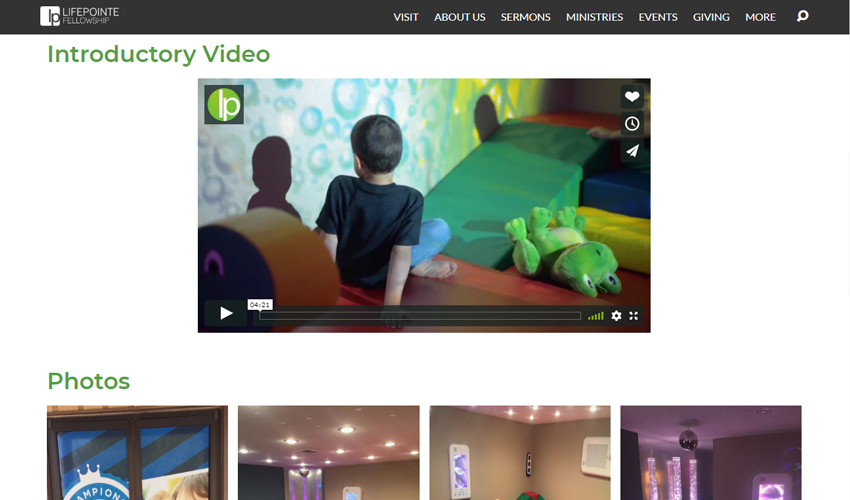
Champions Club at LifePointe Fellowship in Texas is another great example. Vivid photos of their space, information about their ministry, functional links to a map, phone, and email, along with a great introductory video.

Test Your Work
Let’s say that you have implemented many of the changes discussed above but still are curious just how functional it is. A great way to find out is easy: test it. Call up 3 random friends and give them a scenario. Tell them that they are parents or caregivers who will be visiting your church within the next 2 weeks and give them your website. Tell them you want them to visit the website and see if they can quickly find the information that they need.
There have been countless times when I have worked on a project and just felt positive that all the bases were covered. That was until it was turned over to the end user. There were occasions where within a few seconds the end user found an oversight that would have really caused problems. Getting feedback from those who will be using the site is critical in making it better and more functional.
If you would prefer, contact us and we would love to setup a consultation and review your website for you.


